Benefits of Mini Cart: The Ultimate and Guide to Understanding in E-Commerce
Written by Md Ferdous Hassan Alin. Posted in Mini Cart, WooCommerce, WordPress No Comments
Definition of Mini Cart
A mini cart is a small version of the shopping cart you see when you shop online. It shows a quick summary of the stuff you want to buy and how much it costs. You can check and change what’s in your cart without leaving the page you’re on, making shopping easier and faster.
Smooth Online Shopping: Great E-commerce Results
A small mini cart that pops up and shows updates as you shop can be a helpful extra on a regular shopping cart page. It may not seem like a big deal, but if it’s done well, it can make buying things online faster and even make people spend more money per order and buy more often.
Understanding the Contrast: Mini Cart vs. Full Shopping Cart Page
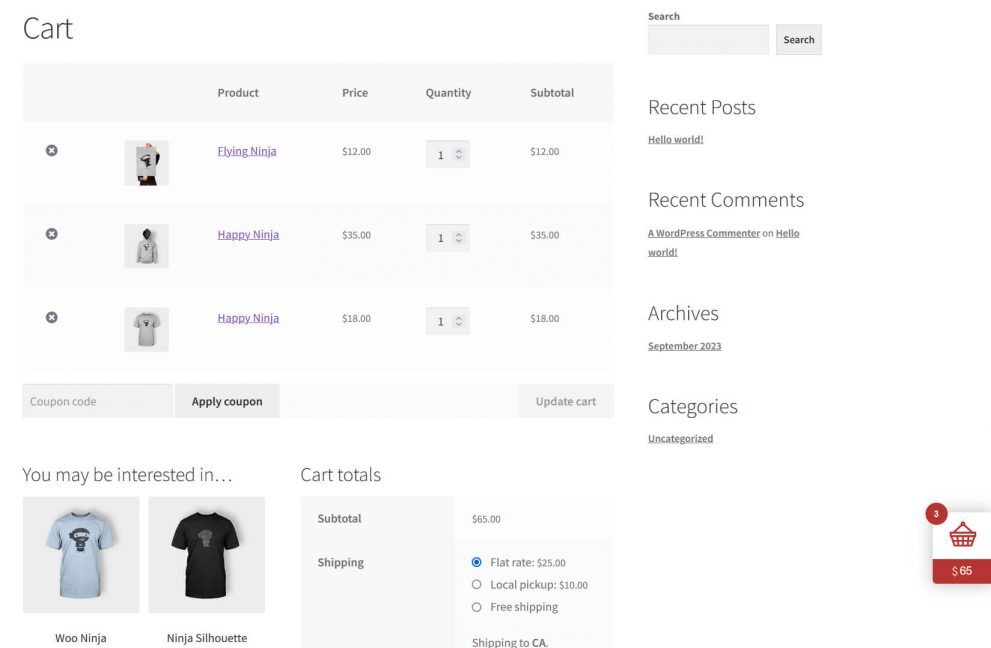
Normally, when people shop online, they click on a little cart or bag icon in the top right corner of the website. This takes them to a new page where they can see everything in their cart. So, they have to leave the page they’re on to change what they’re buying or see how much they’ll have to pay before they keep shopping.
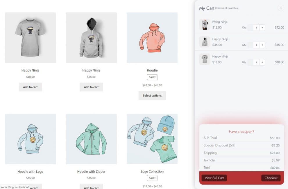
But with a mini cart, things are simpler. It pops up right on the store’s homepage or when you’re looking at a specific item. This way, you can keep an eye on what you’re buying and make changes as you go. It might show up as a little cart or bag icon that shows your order summary when you hover over it, or it could be a side panel that pops up when you add something to your cart. It makes shopping easy and stress-free.
Advantages of Using a Mini Cart for Online Stores
The way people check out online can either help or hurt sales. If it’s hard to do, customers get annoyed and might leave without buying anything. This means they give up on shopping with you and go somewhere else. How your website feels overall is super important for getting people to buy things, make money, and keep coming back.
Having a mini cart online can make a big difference. It makes shopping feel easier and clearer. Plus, it lets people know smoothly when they’ve added something to their cart.
It’s already annoying when you have to switch between different product tabs or lose your place while browsing. You don’t need the extra hassle of messing up your shopping cart too. Sometimes, a shopper might put a t-shirt in their cart, but then find out at checkout that they added pants by mistake because they were looking at the wrong product pages. Letting shoppers see what’s in their cart and how much it costs without having to go to the actual checkout page makes online shopping super smooth.
Reduced Chance of Abandoning the Shopping Cart
When people leave their shopping carts behind, it means they’ve decided not to buy anything — and it happens a lot more than you might realize. The average rate of abandoned shopping carts in online stores is nearly 70%. So, out of every 100 orders that could happen, about 70 of them don’t.
The main reasons for this are usually because of problems with how the website works, like it being hard to use, having to make an account, finding out about unexpected delivery costs, or not having convenient shipping options. But if you have a mini cart that shows the important stuff about their order, it can help you avoid these problems and be upfront with your customers right from the start.
Estimated Total Cost and Delivery Times
As mentioned earlier, shoppers often leave their carts behind when they’re surprised by extra delivery charges. It’s the biggest reason why people abandon their online orders — about half of them do.
So, make sure to be clear about delivery costs from the start. Putting the total delivery cost upfront is important. Gone are the days when you could wait until the end of the checkout process to show it. Include it in your mini cart so it’s one of the first things shoppers see.
You can also add a zip code field for delivery and show an accurate estimate of when the order will arrive and what shipping options are available.
Example of a Great Mini Cart: Mini Cart Drawer For WooCommerce
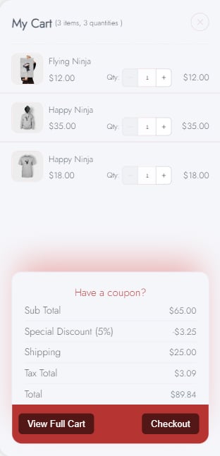
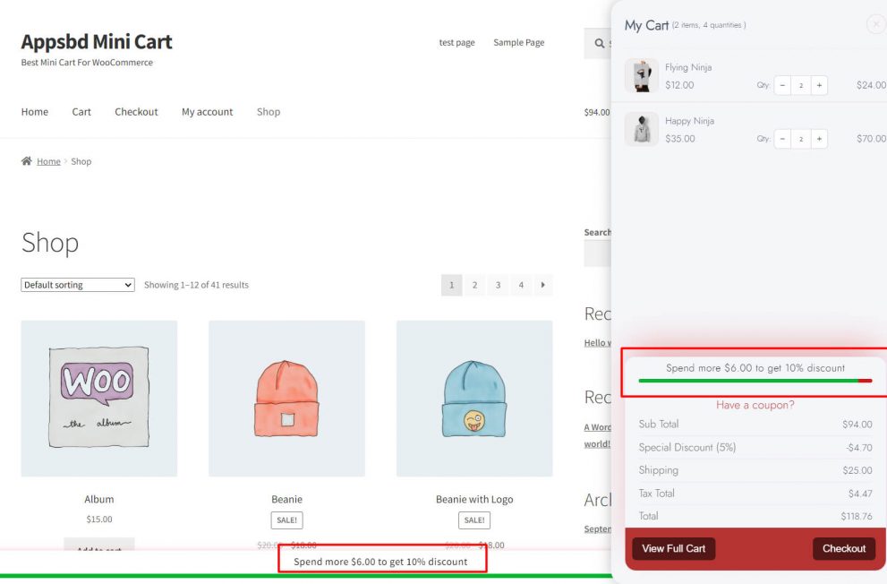
Let’s look at Mini Cart Drawer For WooCommerce as a good example. Their mini cart works like a checkout page for online shopping. It lets you quickly review your order, pick delivery options, and place your order with just a few clicks.
Best Practices for Mini Carts in E-commerce
In a mini cart, customers can either close it by clicking on the X in the top right corner to keep shopping, or they can go straight to the checkout button, or even press ‘Buy Now’ to skip the checkout process entirely.
Here’s what you should include in your mini cart:
- Names of the items added, with links to their product pages;
- Pictures showing exactly what the customer chose;
- Information like size, color, and other important details about the item;
- The quantity of each product, with an option to change it;
- The price of each product, the total cost of the order, and any discounts applied;
- Details about shipping costs, a progress bar showing how close customers are to free shipping, and different delivery options;
- Buttons that help customers move to the next step, especially one that takes them to the checkout.
Tiny Tweaks, Big Results
Customers often add items to their cart to see the order summary, check if the total fits their budget, or see if they qualify for free shipping. This shows why the mini cart is a crucial part of your online store’s user experience. It helps customers interact with your online shop more easily, which makes them more likely to follow through with your call to action (CTA) and improve your conversion rates.

